
We care about the first impression we make and our brand
personality is an important element of who we are.
Brand standards are important, they govern who we are but, as with other collaborative efforts, they’re a work in progress – always growing, evolving with the times. We understand that applying these guidelines can be time-consuming, but the stories we tell in all our Puzzel communications will be stronger for it.
We hope our brand library covers everything you need. If you ever have additional questions about our visual identity and its application in design, don’t hesitate to contact: marketing@puzzel.com.
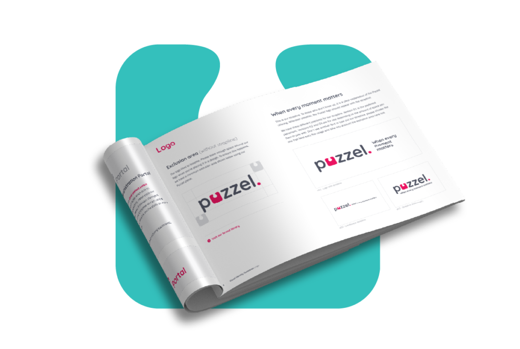
Our logo is bright and bold, it helps us to stand out from the crowd. The logotype echoes our brand values in its informal yet professional nature whilst the ruby hints at our playful side. Please refer to our brand guidelines for usage guidance.
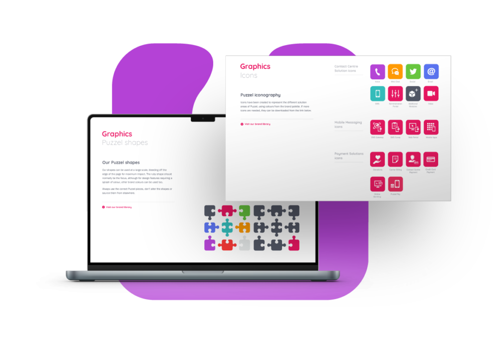
Here at Puzzel we use iconography when referring to products and features. We also use shapes such as the puzzle piece to add a splash of excitement to a page. Please refer to our brand guidelines for usage guidance.
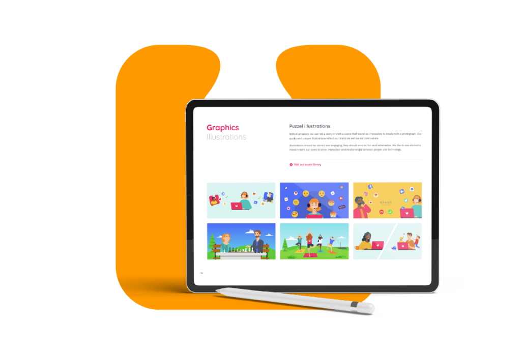
With illustrations, we can tell a story or craft a scene that would be impossible to create with a photograph. Our quirky and unique illustrations reflect our brand as well as our core values.
Illustrations should be vibrant and engaging, they should also be fun and informative. We like to use elements mixed in with our icons to show interaction and relationships between people and technology. Please refer to our brand guidelines for usage guidance.

Strong photography is essential and is a key component of the Puzzel brand. Images used should be in full colour and show people who are positive, confident and friendly. The shots should also be vibrant and engaging, they should show interaction and relationships between people as well as technology. Please refer to our brand guidelines for usage guidance.
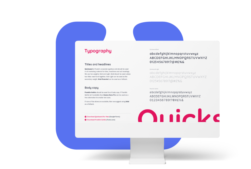
Quicksand is Puzzel’s corporate typeface and should be used in all marketing material for titles, headlines and subheadings. We use two weights; Bold and Light. Bold should be used unless two titles need to sit together, then Light can be used as the secondary weight. Arial Rounded can be used as a fallback. Please refer to our brand guidelines for usage guidance.